 Last week, PBS MediaShift invited me to answer some questions about teaching visualization for its #EdShift Twitter chat. I was part of a virtual panel that included Meredith Broussard (Temple University), Alberto Cairo (University of Miami), Hannah Fairfield (The New York Times), Susan McGregor (Columbia University) and Molly Steenson (University of Wisconsin-Madison; Go Badgers). Katy Culver, MediaShift’s education curator, moderated.
The compiled Q&A is on MediaShift’s website. Some of my tweeted answers were a bit longer than what was captured, so I’m putting them in paragraph form here, lightly edited for typos and readability. My answers may be a bit stilted due to the constraints of tweeting in 140-character bursts.
Q1: Let's start with big picture. When is data visualization most powerful? And why should we be teaching it in J-Schools? #edshift
— Katy Culver (@kbculver) July 29, 2014
We should teach dataviz in J-schools (and other schools as well) because it’s a valuable way to tell people information. Dataviz is most powerful when it elicits emotion and understanding, and makes people remember information.
Q2: First step is finding the data itself. Where do you go to get interesting data? #EdShift
— Katy Culver (@kbculver) July 29, 2014
When first starting out, I think the challenge is getting data that’s relatively clean and easy to understand, so students can focus on the examination/inquiry tasks of data visualization.
Lots of universities collect cleanish datasets, e.g.: University of Edinburgh School of Informatics, Stanford Network Analysis Project (SNAP), and the Open Science Data Cloud public datasets. And one of my favorite data scientists, Hilary Mason, has a collection of research-quality datasets.
For students/dataviz novices, I’d suggest using datasets for things students are already familiar with. Familiar datasets let students dive into analysis and examination without having to climb a high hurdle of subject expertise they don’t yet have. As the analysis and examination techniques become more familiar, start using less familiar and dirtier (messed up, error-laden, not normalized) datasets.
Q3: What is an interesting practice dataset that you use in your class? Any novel assignment ideas? #EdShift
— Katy Culver (@kbculver) July 29, 2014
I love museums & I find museum datasets interesting. Do a web search for “museum collection dataset” & you’ll find things like Sydney’s Powerhouse Museum science and design dataset and the Canadian Museum of Nature collection data. There are many more museum APIs and datasets on this wiki.
Q4: Let's get into specifics on how-to. What tools do you encourage your students to use? #EdShift
— Katy Culver (@kbculver) July 29, 2014
With regard to data visualization tools… Honestly? OpenRefine and Microsoft Excel. They’re not flashy, but OpenRefine is the most useful tool available for cleaning and exploration. And Excel a workhorse. Can’t afford an Excel license? LibreOffice will serve you well.
Q5: How do you teach data viz to total beginners? Should you? #EdShift
— Katy Culver (@kbculver) July 29, 2014
Hannah Fairfield recommended this New York Times lesson plan by Shannon Doyne, Holly Epstein Ojalvo and Katherine Schulten, and I do to. It’s a great resource.
I’d also suggest looking at WTF Visualizations and asking students to point out what’s wrong.
Q6: What are the biggest mistakes to avoid in doing data viz? #EdShift
— Katy Culver (@kbculver) July 29, 2014
The biggest mistake? Assuming everything you need to know is held within the dataset itself.
It’s important to remember that data collection is often skewed in some way. Sometimes it’s maliciously. More often not. Regardless, always ask yourself questions not just about the data, but who gathered it, how it was gathered, why it was gathered, and what other data or information might complement, enhance or refute the dataset you have.
(Question 7 was directed to Alberto, so we move on to question 8…)
Q8: How do you decide if/when something should be interactive? #EdShift
— Katy Culver (@kbculver) July 29, 2014
You could look at the “should it be interactive” or not question a few ways:
1) “Should it move?”
Things that move tend to get a lot of attention. But are you making things move for movement’s sake? Don’t bother.
2) “Does it serve the story well to be presented as a slow reveal?”
Perhaps. For example, look at “Riding the New Silk Road,” which allows the reader to concentrate on the story, be pulled through the narrative, and understand geographic location all at once.

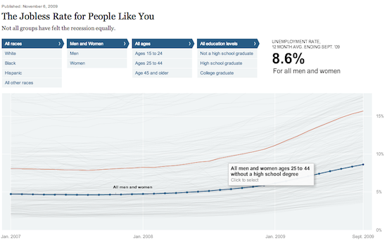
3) “Does the dataviz have something ‘about me’ in it that’s important to discover?”
If it does, then yes, make it interactive. Take for example, this piece on “The Jobless Rate for People Like You.
Q9: It's offically SHOUTOUT time. Tweet links to great projects, tutorials, training etc. #EdShift (@merbroussard I want cupcakes here)
— Katy Culver (@kbculver) July 29, 2014
I’d highly recommend that people interested in data vizualization also work through John Foreman’s “Data Smart: Using Data Science to Transform Information into Insight.” It’s readable and practical, and will teach you great techniques for analyzing data. John is Mailchimp’s chief data scientist.
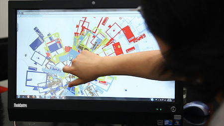
(Photo: Cory M. Grenier/Flickr)
No comments